CLIENT
CERCA — Centres de Recerca de Catalunya
Strategy Events Audiovisuals Web Design Visual identity
CERCA is the system that brings together Catalonia’s centres of research excellence, promoting cutting-edge science, knowledge transfer, and the attraction of international talent. In this project, we undertook a comprehensive renewal of its identity with the aim of building a strong, coherent image capable of representing a high-level scientific community with a clear international outlook.
The challenge: building a shared identity for a diverse scientific community
The challenge was to create an identity capable of representing the entire CERCA network while maintaining a balance between institutional unity and individual diversity. The goal was to develop a recognisable and contemporary image that would reinforce the system’s positioning as an international scientific benchmark, while ensuring harmonious coexistence with each centre’s own identity.
Additionally, the brand needed to function consistently across multiple contexts — institutional, digital, and outreach — ensuring communicative clarity and visual consistency across all touchpoints.

The solution: a flexible visual system based on the concept of research
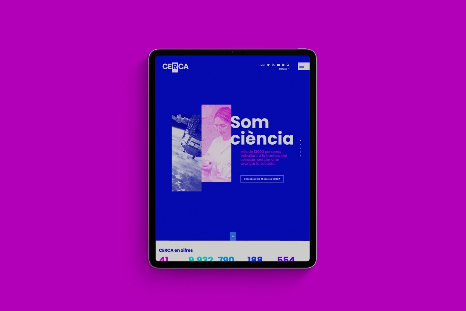
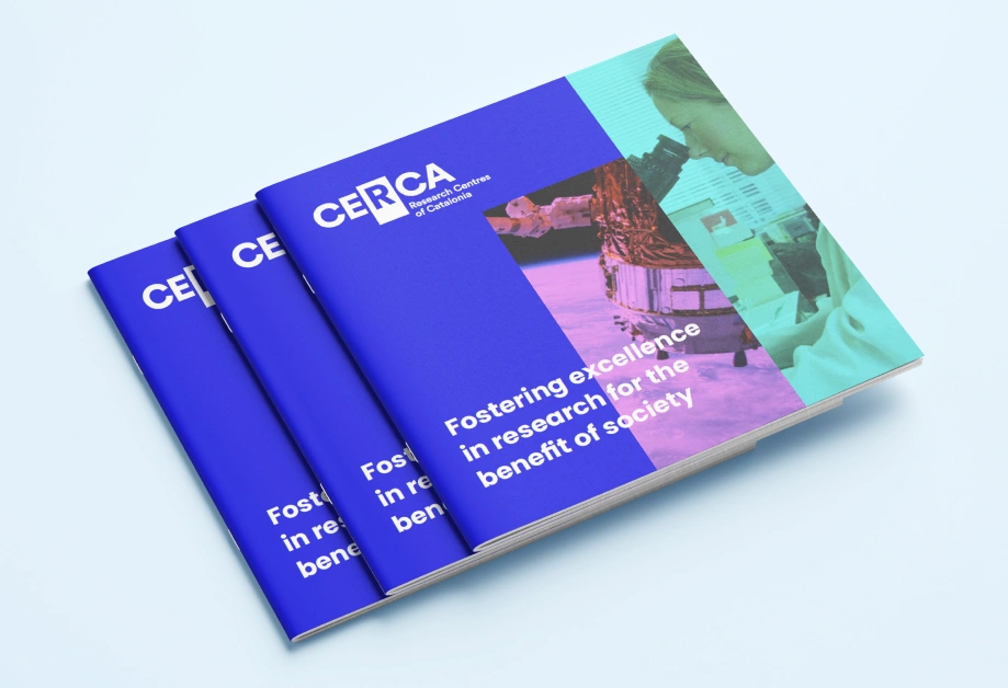
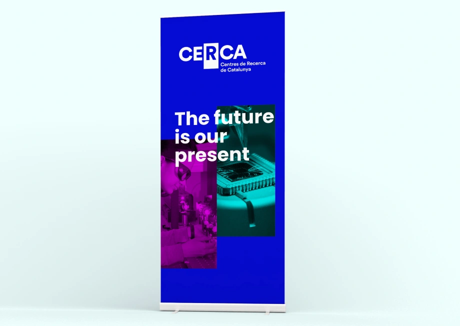
The project included the strategic definition and design of CERCA’s new visual identity. A flexible graphic system was created, centred around the letter “R” for research, integrated within a rectangle that becomes the structural foundation of all graphic applications.
This visual resource, used in both vertical and horizontal formats, allows great versatility and can function with or without imagery inside it, giving the brand a distinctive and coherent identity.
The colour palette was completely renewed to ensure optimal performance, especially in digital environments, and a new typographic family was selected to provide clarity, personality, and consistency across the entire visual system.
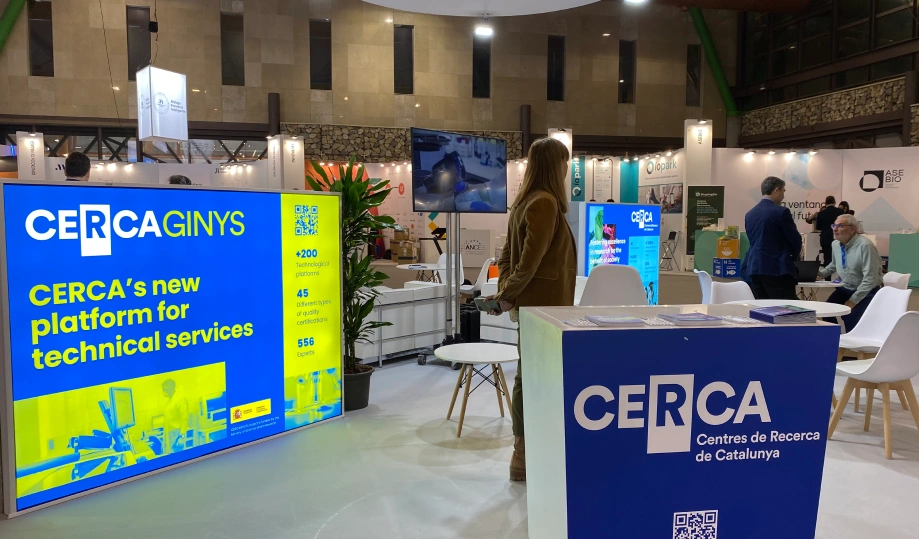
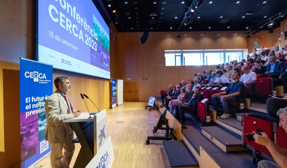
In parallel, we designed and developed the corporate website, ensuring a clear, accessible digital experience aligned with the new graphic identity. Materials were also created for institutional events, stands, presentations, and various communication pieces, guaranteeing consistency across all brand touchpoints.
As part of the project, the “R” emblem was also redesigned — an established symbol that previously presented harmonisation challenges with the centres’ brands. The new proposal replaces the orange colour with a neutral tone — black — ensuring better visual coexistence with any identity while maintaining institutional presence.

Results: a strong institutional identity ready for international scale
The new identity consolidates a more cohesive, contemporary image that represents Catalan scientific leadership. The visual system enables clear and prestigious communication across highly diverse contexts, both physical and digital, strengthening CERCA’s international projection.
The project establishes a robust and scalable foundation for the brand’s future evolution and guarantees communicative coherence within a complex scientific ecosystem.
Additionally, we participated in the production of CERCA’s television advertisement, produced by menta.tv, helping bring the new identity to a wider audience and amplify its communication impact.
Additionally, we had the privilege of participating in the production of the CERCA TV commercial, created by menta.tv, further contributing to conveying the new identity to the broader public and reinforcing its communicative impact.